UX/UI audit and strategic redesign of Ulys' landings

.avif)
Project details
Testimonial

Context
Ulys, the consumer brand of the VINCI Autoroute Group, is now a key player in connected mobility in France. The company offers electronic toll collection and support solutions for motorists, positioned around innovation, reliability, and proximity.
In the summer of 2025, the Ulys acquisition team reached out with a need for fine-tuned optimization of their marketing performance. Their clear objective:
improve the conversion of current landing pages for targeted audiences.
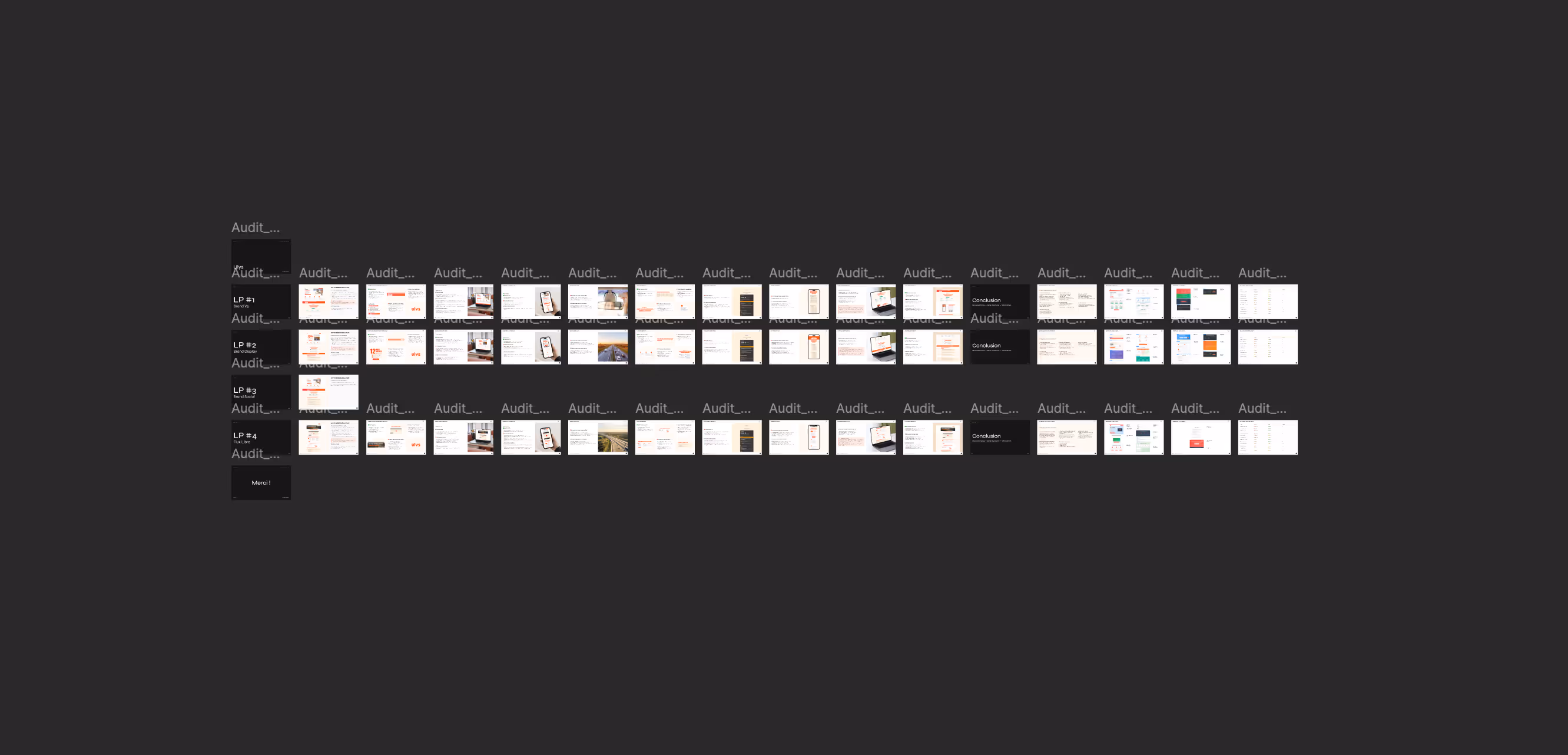
Before considering any redesign, we conducted a full UX/UI audit of the existing landings, particularly those used in Google Ads and Meta Ads campaigns.
This analysis provided a clear diagnosis, not by questioning past work, but by identifying concrete optimization opportunities in:
- Message clarity across audience segments
- Visual and informational prioritization on mobile
- Consistency between advertising campaigns and page content
- Readability of the conversion process
Goals
Following the audit, several objectives were set in collaboration with the Ulys marketing team:
→ Adapt content and structure to match different research or commitment intentions
→ Develop two new distinct landing pages:
- Google Ads audience: more mature, already familiar with Ulys
- Meta Ads audience: younger, often discovering the brand for the first time
With the specific goals to:
- Optimize mobile readability, the main acquisition channel
- Maintain strong consistency with brand identity and campaign messages
- Allow the marketing team to remain autonomous in future landing page iterations
Solutions
1. A complete and actionable UX/UI audit
We began with a detailed analysis of the existing landing pages, covering:
- Mobile and desktop user experience
- Message clarity, scroll fluidity, and overall structure
- Alignment between advertising claims and page content
- Presence and relevance of evidence, CTAs, and redundant or missing sections
- Concrete recommendations (quick wins + structural improvements)
This deliverable became the foundation for all subsequent decisions: UX, copy, structure, and visual hierarchy.
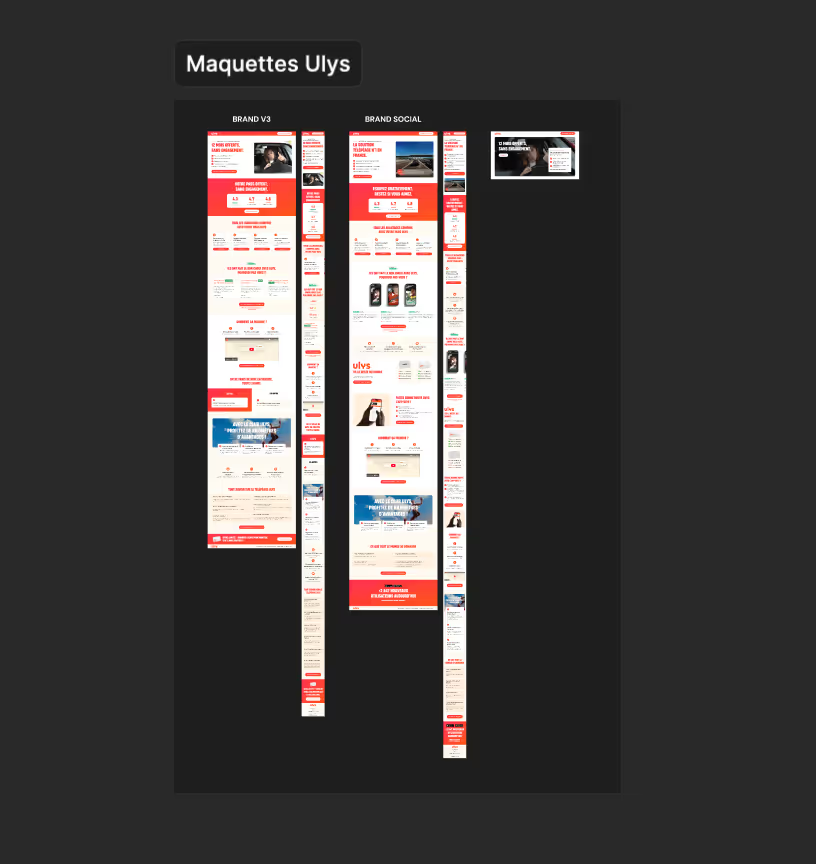
2. UX design of two differentiated paths
Based on the lessons of the audit, we proposed two logical pages:
- Google Ads → a more direct, conversion-oriented journey, with solid reassurance points and a concise argument
- Meta Ads → a more narrative, immersive journey, adapted to an audience in the discovery phase
Each structure has been designed to reflect:
• The promise of the offer upon arrival
• A balance between benefits, operation, and evidence
• Visible, non-intrusive CTAs, placed in the right places
• Fluid and intuitive mobile reading
3. Custom UI design
We then developed these two courses into high-fidelity models (desktop + mobile), with particular attention paid to:
- Continuity with Ulys graphic charter
- The use of explicit visuals to illustrate the concrete benefits
- One strong readability of key elements : CTA, benefits, proof block
- One airy design, reassuring, and flexible to integrate future variants
The deliverables have been designed to easily adapt to the technical environment used by internal teams.
4. Seamless transmission to internal teams
Finally, a restitution workshop was organized to present the deliverables, align perspectives, and prepare the marketing team for implementation.
This key step enabled the team to:
- Gain autonomy in reworking and duplicating models
- Better understand the UX rationale behind each choice
- Lay the foundations of a scalable and duplicable page system, coherent and adaptable over time
Results
As the project is still young, no definitive quantitative data is available at this stage.
However, the qualitative feedback from the internal teams is very positive :
→ Contents clearer, more legible, easier to operate internally
→ Some pages consistent with audience expectations targeted
→ One better synergy between advertising campaigns and landings
→ A solid base for evolve their landing page system over the campaigns
Beyond the redesign of these two landings, this mission marks above all the beginning of a collaboration based on trust, rigor and impact.

More projects from our team
You are one click away from making the best decision for your business!
Schedule a 15-min call and find out how we can help.